Three Black and white logos I created for Corporate Identity Milestone 2. Thanks for your feedback on the logo sketches. Please rate the design you like. 🙂 Color Scheme : GREEN : What green means: Nature. Wealth. Fresh. Life. Harmony. Environment. Growth. New. Notable: Green means “go.” Used frequently to represent eco-friendly companies and... Continue Reading →
Corporate Identity Project: Milestone 1
Company Name: Decadent Café I chose Decadent cafe who serves coffee as well as snacks, as a Imaginary company to design corporate Identity. Target market: Ages between 18 to 40 includes male and female customers. People who work or study can visit the café for coffee/tea /snacks whenever they are out. This cafe is just... Continue Reading →
Ad Composite 1
After Vector portrait, there was an ad composite week. We were asked to create an Advertisement for any product or service of our choice. We had to create this ad for any relevant magazine and for any social media like Google, Instagram or Facebook. This Ad Campaign follows the concept of a travel ad which is... Continue Reading →
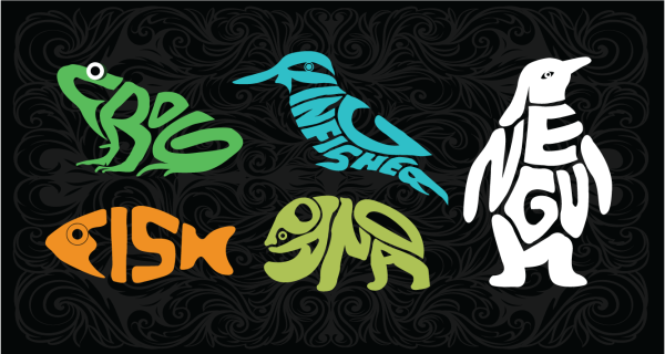
Animal Words
For Typography assignment, We were asked to create five animal words (each animal drawing should contain its word). For presentation, we had to mount on 5"x 7" foam board and create a look and feel like the playing cards. FROG: I chose frog and colored it green. I extended the feet of the frog from the... Continue Reading →
Experience of Creating a VECTOR PORTRAIT
A few weeks ago we were asked to create our own portrait vectors using Adobe Illustrator. We had three weeks to complete the self-portrait. This assignment had seemed tough at first, but Mark gave us detailed instructions how to use the pen tool for detailing and creating different skin tones and brush tool for designing... Continue Reading →
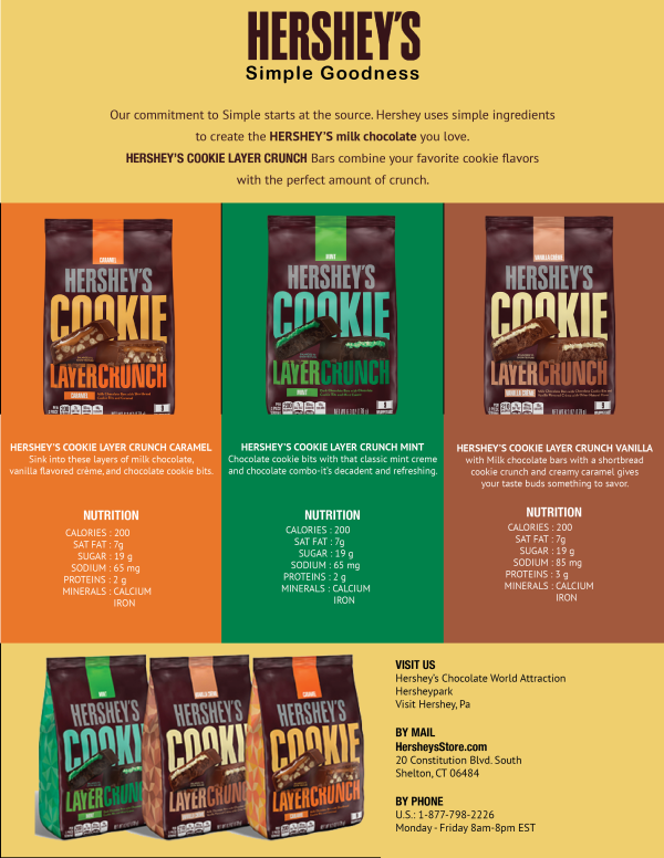
Product Sell Sheet Design
In design week 5 assignment was to create sell sheet for a product or service. So I decided to design sell sheet for Hershey's Cookie Layer Crunch, which they introduced on this Thanksgiving. there are three new flavors in this product line. For the design, First I put the logo on the center top portion... Continue Reading →
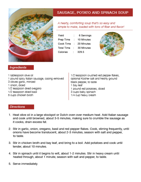
Recipe layout in InDesign
Indesign week 3 we were asked to design a recipe "SAUSAGE, POTATO AND SPINACH SOUP" layout. We were given recipe image and text for this assignment. I had used red color as that image had the red bowl of soup.
Double Page Spread Design
week 2 InDesign, we were asked to create our own double-page spread design of a magazine. My design was about eating the more vegetarian food of a health magazine. I used a background image of vegetables in some of the part and plain area to write text on it. I had included heading, subheading and body text... Continue Reading →
Creating A GIF is an Exciting Experience…
GIF IMAGE The process of creating a GIF starts with the Imagination of the designer involves the real world instances. I have created such one GIF image called "HAPPY FLOWER" for the assignment. It shows the plant growing as I have displayed in the below image. It basically requires the use of Adobe Illustrator and... Continue Reading →


